Illustration & Marketing Campaign
TARGET AUDIENCE
Women (18-50 years of age).
BACKGROUND
This was my first project as a student to recreate an existing product using a pen tool in illustrator application. The idea was to learn using a pen tool. And being a Professional Makeup Artist I choose this attractive lipstick as my project. This is a fictitious marketing project created for the class and, I do take the liberty to say that I am no pro at the content yet.
DESIGN PROBLEM
The whole idea behind choosing this design is because it was pretty and challenging. An eye for the glam products is just my thing. This piece of artistic lipstick design is Inspired by Middle Eastern antiquities and the Art Deco movement, the solid metal body is reminiscent of a precious vial. The turret-like crown cap is topped with a small ring threaded with a silk ribbon, turning the lip color into a necklace as mentioned on the website of Christian Louboutin and credits to it because of which I can make my audiences understand what the idea behind the design is about. Even though the skills of drawing are what this project was about including some latest trends of marketing ideas.
DESIGN PROCESS
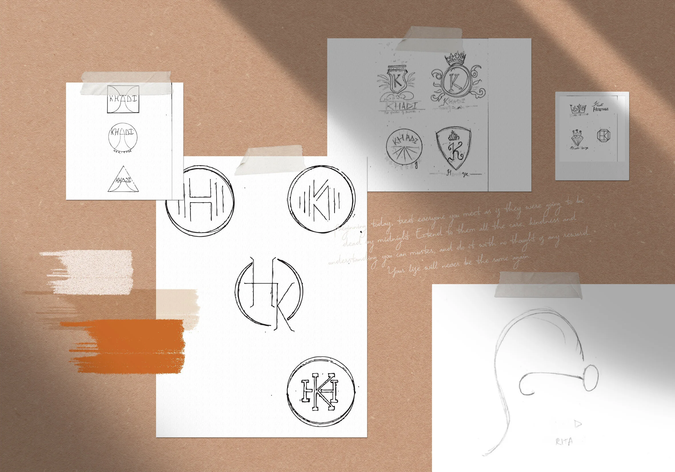
And here we go with the steps and process of this beautiful design. I first created a skeleton that is the outline of the lipstick tracing from the original photo of it using the pen tool in illustration application on adobe cc. And then as taught by our professor I tried layering the fine details over the crown and the body. It was not easy and did not build in a day through the sketch and design was ready in a few weeks it took 9 months of refining till the last day of my portfolio submission. As I kept learning the tricks and ideas to refine my design using illustration application.
And after perfecting the outlines and the fine details I filled the lipstick with the exact same colors from the web so that it looks original and that is how I would know how good I am with my skills and getting near the professional design.
I had to use gradients to add dimension to the design and refine it further with brush strokes to give it a smooth texture. I used transparency on the crown since to get the fine details to look real was not easy. Even after getting this project to life it still had to be refined for print and web purposes. Since the original design gave the feel of a vintage era and my fondness for it I decided to add the golden motif to my fictitious print and web marketing campaigns.
I also named the color of lipsticks, inspired by the Queens from those eras. I used two other bold colors apart from red for the lipstick to match the idea behind the names and the motif I have added behind the lipstick. I’ve used social media, print magazines, websites, billboards display, and mobile mockups to give my audiences a clear idea of why and how marketing side of the project.
SOFTWARE
Illustrator | Photoshop


